Monday, August 13, 2012

Graffiti Experiment

Typically, I don't like to go out of my artistic comfort zone, but lately I've been realizing it is sometimes the better thing to do.  Doing the same stuff over and over again is fine, that's what an artist is good at sure but I believe it can get a little boring creating similar pieces repeatedly.  A gentleman requested for a tattoo that stated "dysfunctional" in graffiti form, such as what someone would see passing by on a train car's side.  Personally, I have always admired such work but never thought of doing it myself.  I figure that those who do graffiti for a living should keep on graffiti-ing and I'll sit back and appreciate the nice artwork they've done on train cars as I sit there pissed off that I'm stuck because of the dumb train itself.

I didn't get any pictures of my awesome outline before I went over with an artist marker, but obviously it looked pretty similar to what you see to the left.  Just a simple outline of what you see as graffiti.  For this, I needed to use a reference because I have never attempted graffiti... Although my poor skills at bubble letters must look something like it, I'm sure.  That's besides the point...  I found some examples of graffiti font online using *cue heavenly music* Google.  Once I found a font that looked similar to what I was envisioning, I let my mind loose and began to draw.  Or write.  However you wish to look at it.
Not much has changed from the last picture, I know.  There is no color for this is supposed to be a tattoo and no decision was made towards what other colors should or could be used.  In that case I left it blank so the gentleman and tattoo artist could figure that out amongst each other.  All I wanted to do was give the letters some depth.

I'm fairly proud of this piece.  One, because I've never done graffiti designs.  Two, because I didn't trace anything to make it look just right.  That's really the beauty of graffiti though, an artist or person doesn't need it to look perfect because graffiti art is about imperfection, in a way.  The flow and direction of the misshaped letters and designs are what make the piece wonderful.  I wasn't sure if it really looked good or not, but the responses I received from it were all positive, which made me feel confident that it didn't look like poop.  Maybe I'll need to try my hand at graffiti art again, but I don't plan on it any time soon.


My apologies for not having made a post in a long time.  Life has been a bit busy lately thus making it difficult to create pieces and posts.  I hope to make another something soon, and that the summer has been treating everyone well.

Monday, June 11, 2012

Processing II

So in a previous post I discussed how drawing is like a process.  Everyone has their own way of drawing, and I've noticed the "processes" can be and are what make the drawing.  It gives each piece their own feel and each piece their uniqueness about them.  I may or may not have this design already posted on here, I can't remember, but I have a great example of how I started with nothing and made it into something.

 Here is the simple outline, believe it or not this is actually a tattoo design.  He wanted a Yamaha R6 and a Suzuki GSXR "peeling out side by side".  So, I found a couple of images of the bikes, and traced a general outline of the bikes.  Yes, traced.  Vital for tattoo designs, you want the subjects to be totally proportional as you can get them to be.
 Now the fun part.  As you see I've just began with the shading starting on the left.  I don't know why, I just seem to go from right to left as a habit.  As well as gotten some smoke in the background to give that "peeling out" effect, along with the burn out marks.
 Almost done with the Yamaha R6!  Being vehicles and shiny, you gotta keep in mind where your "light source" is in the picture.  I just kept it how it was in the pictures I traced.  As for the shading, it was virtually extreme light or dark.  Hardly any medium between them (grey).
 I can tell you that this was a pain in the ass trying to shade everything in just right, but it was mainly the tires and the rims I had the most issues with.  Then with some of the finer smaller details of the mechanics.  I couldn't fit every detail in there, but with those types of things you want to get the major functioning parts that people will recognize, especially if it's vital towards the subjects ability to function in real life.
 Now on to the GSXR.  Although they may look the same, both being crotch rockets and all, drawing them in detail like this really makes one realize the differences between makes and models.  It was pretty cool seeing how they were different and shading in over the contours of their bodies.
Finally finished!  The scanner that is provided to me kind of sucks, but I make do.  You can't really see the smoke in the background but hey, you and I know it's there.  With a photo editing software, I usually make the contrast of the picture a little stronger so the lights and darks are emphasized to my liking-because I wish I could do that in the first place but am too scared.  This is indeed one of my favorite designs and drawings.  Quite a few other people seem to like it as well, which always makes me feel good.

I hope this works a little better towards what I was trying to get at in my previous post about the "process" of drawing.

Tattoos: Prices & How To Request Designs

So, this isn't about how to price tattoos and how to actually request designs.  This is what I'm going to be pricing tattoo requests as, and describing how people (or you) should request them to me if such a thing is to occur.  This is not because I think my "customers" are stupid and don't know how to tell me what they think they want, but because I want this to be as clear and as simple as possible so I can get all the details and not bother my "customers" so much by asking a lot of questions.  With that said, enjoy.


P.S. The pricing also applies to any requested logo designs, please follow the same procedure in the "Tattoo Request" page.  If there are issues in reading either pages because of my awesome handwriting, just email me at tyannecherise@gmail.com

P.S.S. Feel free to creep me up on Facebook @ https://www.facebook.com/tyannecherise as well at Twitter @tyannecherise

Tuesday, June 5, 2012

Process

When drawing, sketching, painting, designing, whatever... There is a process.  Steps towards making the final result.  There is never really an end to what ever the piece is.  The process ends when you feel it is satisfactory towards your, and others, visual needs.  Here is an example of one of my recent designs, that I literally finished just prior to making this.

I know it's difficult to see, the scanner I use varies on the quality of what it scans and unfortunately you can't see all of the smaller, finer lines I have on here... For the purpose of this blog post I'm just using this design because 1) I just finished it and I am really impressed by it and 2) I always like to see how artists went from nothing to a masterpiece, although this is a far cry from being so.  I don't have many pictures from my nothing to masterpiece, and I apologize.  I do have more varieties on my Facebook page if you're really that interested, there's an album dedicated to my Tattoo Designs & Requests.  Feel free to look at it.

Here you just see basic outlines of what appears to be a cross with stuff all wrapped around it.  I began originally with the shape of the cross, then plotted where I wanted the barbed wire to go, along with where I wished for the roses to be and where their vines would wrap around as well.  I do use websites and pictures/photos, even other artist's works as references.  No, I do not copy them.  I find it easier to see how someone else drew it out, or how the subject is naturally in order to get it as close to the real thing as I can in my drawing.  By seeing someone else's work, you can see their pencil or paintbrush strokes and where they shaded heavily or had no shading at all, and that alone can help you figure it out on your own.

Now finished, it's a big difference from what I had started with.  Shading really makes images and drawings and paintings pop.  There's so many little techniques that one can't really explain to another, something an artist has to figure out on their own.  Those techniques are what make them unique, what makes their art works theirs.

I added a shit ton of shading, but what was difficult was all the small areas and details I needed to fill.  From the body of the cross, to the vines, the roses, the barbed wire, to the blood dripping off of various parts of the design.  I did not add any colors solely for the fact that yes, I am scared to use colors in my pieces because I'm not yet confident in my coloring skills.  On top of the fact I prefer to do designs in black and white so in case the requester of the design wants it that way, and if they change their mind all they have to do is tell the tattoo artist they see to add the colors they want.

If I were to add colors, I wouldn't do the whole thing.  Simply just add a vibrant red to the dripping blood so it'd be easier to spot them.  If that wasn't enough, then I'd also make the roses a vibrant red as well, but leaving everything else black and white.  Why ruin what I have with too much colors?  There is enough going on with the vines and barbed wire wrapping around, no point in confusing viewers with colors in the mix.  That is what I personally feel about that.

Maybe later I will create a similar post as this about the process of drawing using a different drawing or artwork that better illustrates the different processes used...  That will come in time.  Instead, enjoy my latest piece and appreciate the beauty of the world around you!  Okay, kind of cheesy...  Just have a wonderful day.

Thursday, May 31, 2012

Catching You Up With Bitches and Other Tattoos

I haven't been too keen on posting lately, my apologies.  But aside from that inconvenience, I bring you good news.  I have made a few pieces you may enjoy.  Tattoo requests have been coming in up the ying yang, so tattoo designs are what you're about to see.

This here was a request not long ago from this post by one of my co-workers.  (I currently work at Hobby Lobby, kind of ironic)  He wanted a realistic looking pin-up girl as well as incorporating the Harley Davidson bar and shield logo.  That was about all the information I got from him, and so this is what I came up with.

I envisioned something else, but for whatever reason this is what happened in the end.  I'm not too sure about the face, I don't care for faces because it's hard for me to get facial features and expressions...  So.  At least she has a sexy body going for her.  On Facebook a bazillion people liked the picture... Which makes about 16 people.  For me, feels like a lot.

Fun fact:  She is saved into my laptop as Harley Bitch.


This happened to be finished as of the night before this post.  It too is a request from a co-worker.  She asked specifically for a cross with roses wrapped in it.  Something kind of fancy.  Something that fits the calf area.

And viola, this is what I came up with.  I wasn't completely sure if she wanted a few larger roses or a lot of little ones, so I took the liberty of making a bunch of little roses.  I kept the details of the cross to make it appear fancy, but yet it's simple all at the same time.

I have no fun fact for this one.


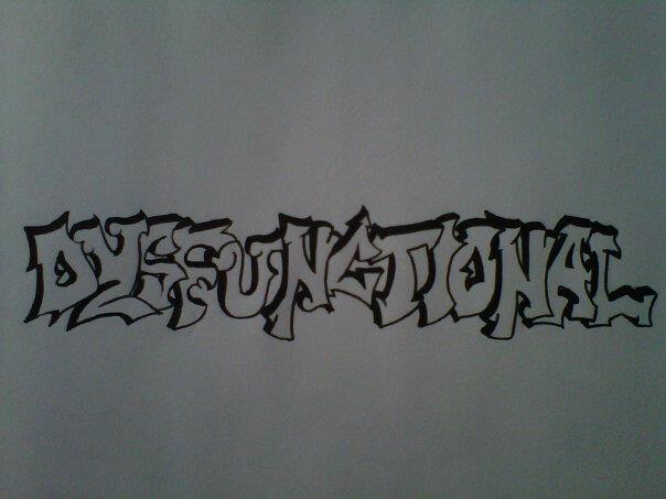
I know, this isn't a tattoo.  And yes, I know, its crappy quality, I'm sorry.  Maybe I'll post it again once I get a better scan on it.  All you need to do is enjoy what you see, and we have no problems.

From what you can see, this is a logo I had been asked to design for a friend located nearby my hometown.  So this was a bit of a pain in my ass.  The lettering was last minute decision because the font I wanted to use wouldn't download.  So I resorted to this font.  He specifically asked for those words, "Bear Arms Weaponry and Gunsmith", along with an AR-15.  The AR-15 is the fancy gun you see there.  I'm getting to know that drawing actual subjects vs. writing out letters, whether be simple or complex, that drawing subjects is so much easier.  Writing out letters and fonts is highly and overly complex and irritating.  To me.

I had complications with the lettering.  I had a different idea for it, that didn't work out too well so I resorted to filling them out in red ink, and I went out to Hobby Lobby to buy a paint pen to give that shiny 3D-ish look effect to the letters.

In the end he was pretty happy with it.  I can't lie, I do like the gun.

So that is all for this post.  I have a few other pieces I could show you all, I'm sure.  There is more to come, don't worry.  Maybe, because it seems I have misplaced a tattoo design I was working on...  Let's hope it comes up soon.