Typically, I don't like to go out of my artistic comfort zone, but lately I've been realizing it is sometimes the better thing to do. Doing the same stuff over and over again is fine, that's what an artist is good at sure but I believe it can get a little boring creating similar pieces repeatedly. A gentleman requested for a tattoo that stated "dysfunctional" in graffiti form, such as what someone would see passing by on a train car's side. Personally, I have always admired such work but never thought of doing it myself. I figure that those who do graffiti for a living should keep on graffiti-ing and I'll sit back and appreciate the nice artwork they've done on train cars as I sit there pissed off that I'm stuck because of the dumb train itself.

I didn't get any pictures of my awesome outline before I went over with an artist marker, but obviously it looked pretty similar to what you see to the left. Just a simple outline of what you see as graffiti. For this, I needed to use a reference because I have never attempted graffiti... Although my poor skills at bubble letters must look something like it, I'm sure. That's besides the point... I found some examples of graffiti font online using *cue heavenly music* Google. Once I found a font that looked similar to what I was envisioning, I let my mind loose and began to draw. Or write. However you wish to look at it.
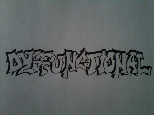
Not much has changed from the last picture, I know. There is no color for this is supposed to be a tattoo and no decision was made towards what other colors should or could be used. In that case I left it blank so the gentleman and tattoo artist could figure that out amongst each other. All I wanted to do was give the letters some depth.
I'm fairly proud of this piece. One, because I've never done graffiti designs. Two, because I didn't trace anything to make it look just right. That's really the beauty of graffiti though, an artist or person doesn't need it to look perfect because graffiti art is about imperfection, in a way. The flow and direction of the misshaped letters and designs are what make the piece wonderful. I wasn't sure if it really looked good or not, but the responses I received from it were all positive, which made me feel confident that it didn't look like poop. Maybe I'll need to try my hand at graffiti art again, but I don't plan on it any time soon.
My apologies for not having made a post in a long time. Life has been a bit busy lately thus making it difficult to create pieces and posts. I hope to make another something soon, and that the summer has been treating everyone well.